Jordilis
DISCIPLINE
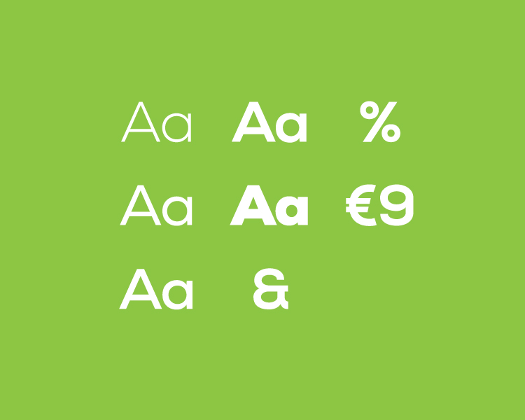
Brand Identity
YEAR
2019
TEAM
Netgócio
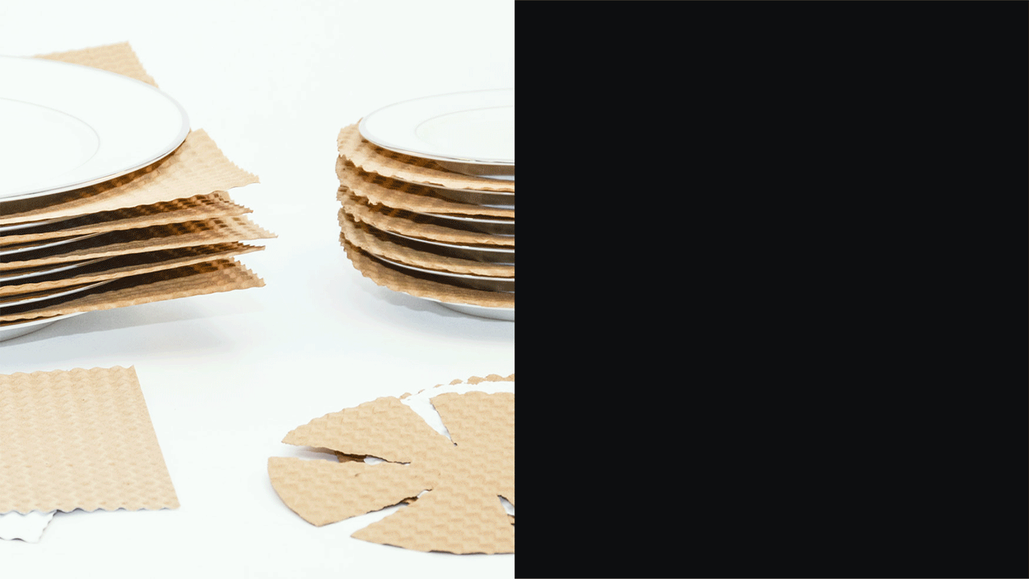
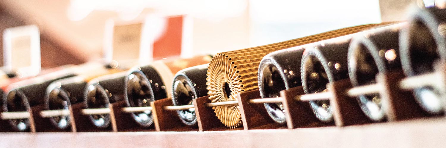
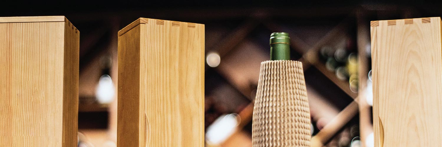
Jordilis is a company specialized in the manufacture of anti-shock protectors in corrugated papers. They have a wide range of products with different characteristics and specifications, being used mainly in the ceramics, printing, food and wine industry.
Being an inherited family business, with more than 30 years of experience, the goal of the new owner was to modernize the brand. It was requested the creation two graphic identities:
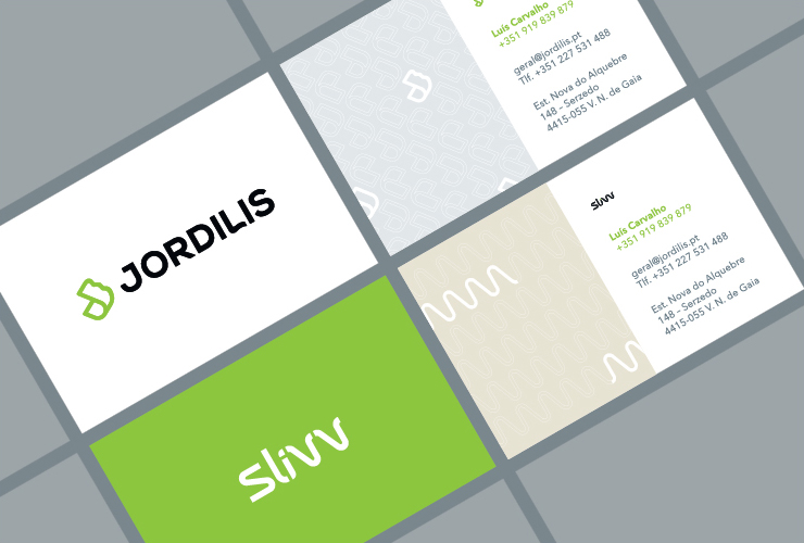
Jordilis, the main company
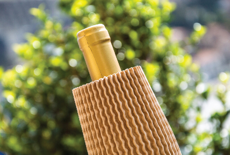
Slivv, a bottle protector (wine industry)
As it is a company that is increasingly focused on sustainability and the ecological aspect of its business, the proposal should reflect these values. I was responsible for the entire rebranding project.
SOLUTION
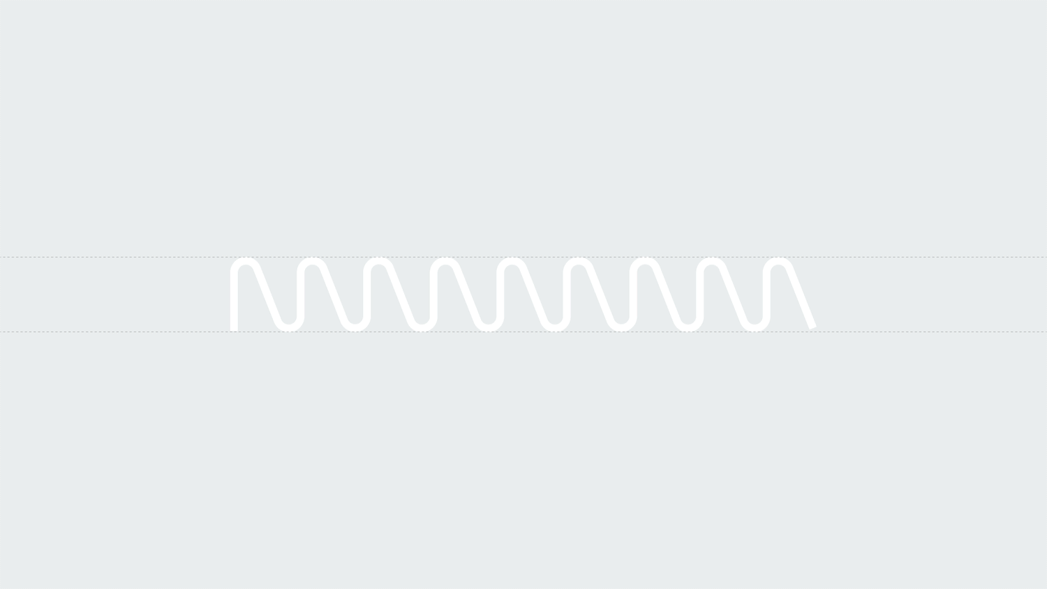
The idea for the Jordilis project was to represent through a symbol the concept / objective behind the company's products, the protection factor. The Slivv logo emerged from the unique texture of the cardboard used to manufacture the protective sock for wine bottles.
Concept
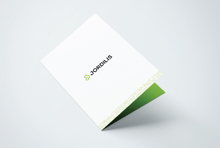
The Jordilis symbol was born from the concept of protection and the stylized representation of the letter J.

Slivv
One of the many products that Jordilis provides is Slivv, specifically designed to protect and pack wine bottles.
Since it is a new product, part of the initial development process was choosing the name, which was also created by our team. Slivv comes from the english word “sleeve”. The product works precisely that way, embracing the fragile glass interior as a protective sleeve.
The concept for the logo came from the unique texture of Slivv's corrugated paper. The characters that would generate the logo were born from the geometric pattern of the product.

EXPLORE MORE PROJECTS
Póvoa de Varzim | Diogo CostaBranding

Ambitrevo | Diogo CostaBranding
Edit Value | Diogo CostaBranding
Jordilis | Diogo CostaBranding